r/dataisbeautiful • • 11d ago

Discussion [Topic][Open] Open Discussion Thread — Anybody can post a general visualization question or start a fresh discussion!

3 Upvotes

Anybody can post a question related to data visualization or discussion in the monthly topical threads. Meta questions are fine too, but if you want a more direct line to the mods, click here

If you have a general question you need answered, or a discussion you'd like to start, feel free to make a top-level comment.

Beginners are encouraged to ask basic questions, so please be patient responding to people who might not know as much as yourself.


To view all Open Discussion threads, click here.

To view all topical threads, click here.

Want to suggest a topic? Click here.


r/dataisbeautiful • • 5h ago

OC [OC] How many words do English learners and native speakers know?

Post image
273 Upvotes
  1. Even at the same proficiency level, people can have vastly different vocabulary sizes, literally by a factor of two. The same for native speakers: one person can know twice as many words as another of the same age.
  2. Advanced learners (C1) reach the level of native-speaking middle schoolers, and proficient learners (C2) reach the level of college students in terms of how many words they know. The composition of their vocabularies is no doubt different, but this test can’t capture that.
  3. It appears that vocabulary keeps growing well into adulthood for native speakers - older adults know measurably more words on average compared to younger ones. That matches what is known about crystallized intelligence - it accumulates over time. However, these data are not longitudinal; they do not capture the same people years later. It is possible that older adults who decided to take an online vocabulary test are more educated on average than younger ones.
  4. For learners, reaching each proficiency level requires learning progressively more words. It is understandable since beginners focus on common words, so a limited number of them covers many everyday situations, and advanced learners need to learn many more specialized and nuanced words.

The data are based on 46,000 native and non-native speakers who took the BRAVE vocabulary test. It is not a representative sample; there is strong self-selection bias (people who care enough to take a test of their vocabulary). A1-C2 are CEFR levels, a common classification of proficiency among language learners. The levels were self-reported. The counting units are word families (limit, limitless, unlimited are counted as a single unit). The full reference lexicon is 28k word families.


r/dataisbeautiful • • 17h ago

OC [OC] Trending Google searches by US state over the last 12 months

1.9k Upvotes

r/dataisbeautiful • • 7h ago

OC [OC] Average Annual wages in OECD Countries

Post image
215 Upvotes

r/dataisbeautiful • • 14h ago

OC [OC] 1,000 people start with $100 each and bet on a fair coin. In all 100 simulations, one person ended up with half the money.

Post image
672 Upvotes

Source: my own simulation of the "yard-sale model" (Boghosian 2014, https://arxiv.org/abs/1212.6300). Python + NumPy, chart in matplotlib

Rules: 1,000 people each start with $100. Every day everyone is paired at random and they flip a fair coin. The loser pays the winner 20% of whichever of the two has LESS money. No money is created or destroyed.

What the chart shows: each grey line is one of 100 runs (different random seeds), plotting the share of all money held by whoever is richest that day. The dots mark the first day someone held 50%. That happened in all 100 runs: fastest 31 years, median about 61, slowest 114.

Why a fair coin does this: a 20% win followed by a 20% loss leaves you at $96, not $100. And because the bet is capped by the poorer person's money, the richest person only risks a tiny slice of their own (about 0.03% late in a run), while everyone below the median risks around 20%. The average person always has $100; the typical person drifts toward $0.

Change one rule (bet 20% of the loser's money instead) and nobody ever holds more than 1% of total wealth.

It's a toy model, not a description of a real economy: nobody produces anything, earns wages or inherits. I made a video walking through it, including what happens with different rules: https://youtu.be/LfZbKEAR0-4


r/dataisbeautiful • • 10h ago

OC Gamified my town's 2027 budget [OC]

Post image
281 Upvotes

I love my growing town in Holly Springs, North Carolina, just outside of Raleigh.

I wanted to let my kids explore how our taxes are divvied up among the different services we receive, and just how complicated it is to manage a growing town.

Turns out, I've gotten a ton of really positive feedback from friends and neighbors as well. So I deployed it as standalone website.

You can explore each of the services and see not just budget data about each department, but other factoids about the services.

I think it's a really fun way to explore really complex datasets - let me know how I can improve it!

I would recommend a tablet or desktop/laptop over a phone:
https://towntoonify.com/


r/dataisbeautiful • • 10h ago

OC Largest Ex-Religion Communities on Reddit [OC]

Post image
148 Upvotes

r/dataisbeautiful • • 21h ago

OC [OC] Twelve years of my Spotify streaming history: 202,088 plays and how my taste moved in eras

Post image
1.0k Upvotes

What I found interesting about the Spotify analysis was that it also stores the devices you've used. Totally crazy, because I saw that I'd used a Galaxy S II and then a Galaxy S5 mini until 2016. Really wild, but good to know what I used to have, lol.


r/dataisbeautiful • • 9h ago

OC [OC] Solar supplied 76% of the increase in global electricity generation in 2025

Post image
107 Upvotes

r/dataisbeautiful • • 13h ago

OC [OC] I mapped U.S. wealth share by the age of each birth cohort (1950–2025). The data shows a stark 10+ year delay in the lifetime peak wealth

Thumbnail
gallery
204 Upvotes

I wanted to see how the "wealth lifespan" of Americans has changed over the last 75 years, so I normalized historic Federal Reserve and SCF data by the age of each generation, rather than just plotting it by year.

Quick legend:

  • Dark Brown (Oldest): Born pre-1920
  • Ochre/Amber (Middle): Born 1930s to 1950s (Boomers/Silent)
  • Greens (Youngest): Born 1960s to 2000s (Gen X, Millennials, Gen Z)

A few eye-opening patterns stand out from this lifespan alignment:

1. The "Peak Wealth" age didn't just drift—it popped forward 15 years. Look at the hump of the curves. The older cohorts (browns, born before WWII) used to peak in their share of total national wealth when they were around 40 to 45 years old. But then, almost on a dime, the cohorts born during/after the 1940s (amber) shifted their peak to age 55. And now, looking at the trajectory of the younger cohorts (greens), they aren't projected to hit their peak until age 65 or older.

We still have the same lifetime "hump" of wealth, it just happens roughly 15-20 years later.

2. The 20-year-old wealth gap is staggering. If you look at the Age 20–25 mark on the x-axis, you can see exactly how much poorer young people are today relative to the rest of the country than they were 50 or 80 years ago. Historically, 20-somethings actually owned measurable, visible slices of total American wealth (upwards of 5% to 12% collectively for the early 1900s cohorts). Today, 20-somethings (green lines) are virtually flat on the 0% floor. Between skyrocketing student debt, runaway housing costs, and asset inflation, younger generations are starting their adult lives with a massive, unprecedented financial delay.

3. The mid-century "switch." It's fascinating how abrupt the shift was. The older generations (pre-1939) saw their wealth share decline much earlier in life, likely because they handed assets down or didn't have modern retirement systems. Once Social Security matured and the post-WWII economy took off, the mid-career and older generations (1940s+) were able to compile and hold onto vast amounts of wealth much longer.

The timeline for the "American Dream" has been pushed back. Young people aren't necessarily "failing", you are just living on an economy-wide lag where peak wealth has been deferred from early mid-life to the doorstep of retirement.

4. The humps. They're not way different in size. There doesn't appear to be a huge hanging boomer bump that isn't going away. If anything, they blew their retirement.

5. 20 somethings. The youngest generation of 20 somethings are actually doing significantly better than prior generations at their age.

6. Richer actually? Every generation seems to show a greater potential peak of wealth with longer times spent being low wealth.

Disclaimer: I made this with Gemini and I verified, double checked, but still, I made this with AI. If you really hate AI go ahead and downvote me but I think parsing dense and hard to decipher complex data and turning it into something digestible and beautiful is worth the little bit of water. I would drink a lot lot more water doing this myself.


r/dataisbeautiful • • 14h ago

Anatomy of a r/dataisbeautiful flame war.

Thumbnail
gallery
154 Upvotes

My earlier post, “Gaza Violent Death Rates from GHM Reports [OC]”, drew a very long and heated comment thread. I saved nearly all the comments and wanted to visualize them in various ways.

What you’re looking at: 1,315 comments, drawn as 104 reply trees. Each tree is one thread, with the root comment at the bottom and replies climbing one level per row. Blue is pro-Israel, red is pro-Palestinian, and each dot’s fill and shape show tone and propaganda accusations. The second image explains how to read this.

How it was made: I hand-labeled every comment for the side it took and for how "constructive" its tone was. Constructive to me means: discuss data rather than the topic in general, engage with the data rather than other commenters, assume good faith, and don’t flame. Each comment was also run past Claude and Gemini prompted for each label, and I reviewed the disagreements. In the interactive version, you can modify the labels to whatever you think is correct.

A few things that stood out:

  • 89% of replies between two side-taking comments crossed sides. These threads are mostly back-and-forth exchanges, leading to the red/blue striping.
  • Commenters basically picked a side and stuck to it. Neutral framing was incredibly rare.
  • While number of comments was somewhat balanced (658 vs 566), there were many more unique pro-Israel commenters, and voting was very pro-Israel (only fuzzed net votes are available). Post upvotes ratio was at 70%, with 10% of all views being from Israel.
  • Both sides had similar behavior, with two slight exceptions
    • Pro-Israel commenters were more likely to accuse someone of consuming propaganda (TikTok videos, biased media, Hamas reports)
    • Pro-Palestine commenters were more likely to accuse someone of spreading propaganda and particularly of not being a legitimate participant (bot, honeypot, Mossad agent)
  • Voters penalized pro-Palestine commenters, commenters who didn't discuss the data, and commenters who engaged personally (less so if they went all the way to a flame). They rewarded pro-Israel commenters.

Interactive version: https://drc500free.github.io/visualizations/flame-war/

Hover or tap any comment to read it and trace its chain. Labels are judgments, so I expect some disagreement - which is why you can change them!

Sources and tools are in the first comment.


r/dataisbeautiful • • 14h ago

OC [OC] I mapped U.S. wealth share by the age of each birth cohort (1950–2025). The data shows a stark 15+ year delay in the "American Dream."

Post image
165 Upvotes

EDIT: Apparently my chart sucks
Fixes:
Remove pre 1920 cohort.
Remove projected data. for latest (youngest) cohort.

Not going to fix:
Percentage of wealth. That's the point. It also shows when each cohort is the wealthiest in their life.

FINAL EDIT:
Updated post:

https://www.reddit.com/r/dataisbeautiful/comments/1x47ogb/oc_i_mapped_us_wealth_share_by_the_age_of_each/

Original post:
I wanted to see how the "wealth lifespan" of Americans has changed over the last 75 years, so I normalized historic Federal Reserve and SCF data by the age of each generation, rather than just plotting it by year.

Quick legend:

  • Dark Brown (Oldest): Born pre-1920
  • Ochre/Amber (Middle): Born 1930s to 1950s (Boomers/Silent)
  • Greens (Youngest): Born 1960s to 2000s (Gen X, Millennials, Gen Z)

A few eye-opening patterns stand out from this lifespan alignment:

1. The "Peak Wealth" age didn't just drift—it was delayed by 15 to 25 years. Look at the hump of the curves. The older cohorts (browns, born before WWII) used to peak in their share of total national wealth when they were around 40 to 45 years old. But then, almost on a dime, the cohorts born during/after the 1940s (amber) shifted their peak to age 55. And now, looking at the trajectory of the younger cohorts (greens), they aren't projected to hit their peak until age 65 or older.

We still have the same lifetime "hump" of wealth, it just happens roughly 15-20 years later.

2. The 20-year-old wealth gap is staggering. If you look at the Age 20–25 mark on the x-axis, you can see exactly how much poorer young people are today relative to the rest of the country than they were 50 or 80 years ago. Historically, 20-somethings actually owned measurable, visible slices of total American wealth (upwards of 5% to 12% collectively for the early 1900s cohorts). Today, 20-somethings (green lines) are virtually flat on the 0% floor. Between skyrocketing student debt, runaway housing costs, and asset inflation, younger generations are starting their adult lives with a massive, unprecedented financial delay.

3. The mid-century "switch." It's fascinating how abrupt the shift was. The older generations (pre-1939) saw their wealth share decline much earlier in life, likely because they handed assets down or didn't have modern retirement systems. Once Social Security matured and the post-WWII economy took off, the mid-career and older generations (1940s+) were able to compile and hold onto vast amounts of wealth much longer.

The timeline for the "American Dream" has been pushed back. Young people aren't necessarily "failing", you are just living on an economy-wide lag where peak wealth has been deferred from early mid-life to the doorstep of retirement.

Disclaimer: I made this with Gemini and I verified, double checked, but still, I made this with AI. If you really hate AI go ahead and downvote me but I think parsing dense and hard to decipher complex data and turning it into something digestible and beautiful is worth the little bit of water. I would drink a lot lot more water doing this myself.


r/dataisbeautiful • • 2h ago

OC [OC] Every hurricane that made landfall in the contiguous United States since 1980 (74 storms, 25 of them major)

Post image
14 Upvotes

Source: IBTrACS v04r01 from NOAA's National Centers for Environmental Information. Landfall points and wind speeds come from the National Hurricane Center's best-track landfall records (HURDAT2). For 1980–1982, which lack those records in IBTrACS, landfalls were derived from the track positions.

Method: Only landfalls at hurricane strength (64+ knots, 1-minute sustained) in the lower 48 states are counted. Hawaii, Puerto Rico and other territories are excluded. A hurricane that hit two states counts once in each state, at its strongest landfall there. Tracks are 6-hourly positions, coloured by Saffir-Simpson category.

Tools: Node.js and d3-geo for the analysis and maps (Albers projection, Natural Earth state boundaries), rendered with Playwright.

A few things that surprised me. Florida took 22 of the 74, more than any other state, and 12 of those were major hurricanes. 13 of the 46 seasons had no US hurricane landfall at all, including 2025. And not a single hurricane came ashore between December and May.

High-resolution PDF, free to reuse (CC BY 4.0): liveatlas.earth/cyclones


r/dataisbeautiful • • 13h ago

OC [OC] Every Divvy bike-share ride in Chicago in 2025, by hour of day and day of the year

Post image
53 Upvotes

r/dataisbeautiful • • 16h ago

OC [OC] Around 550 trains moving through Sweden, Finland and Norway, coloured by delay

Thumbnail
gallery
89 Upvotes

r/dataisbeautiful • • 5h ago

OC [OC] China's railways carry 44 times America's passenger traffic on 69% of the track (World Bank WDI, 1995-2021)

Post image
13 Upvotes

r/dataisbeautiful • • 16h ago

OC [OC] The US imported $327B from China in 2025, and exported $106B back. Here's what they traded

Post image
82 Upvotes

r/dataisbeautiful • • 18h ago

OC [OC] Total fertility rate (births per woman) in 10 countries, 1960–2024

Post image
86 Upvotes

r/dataisbeautiful • • 13h ago

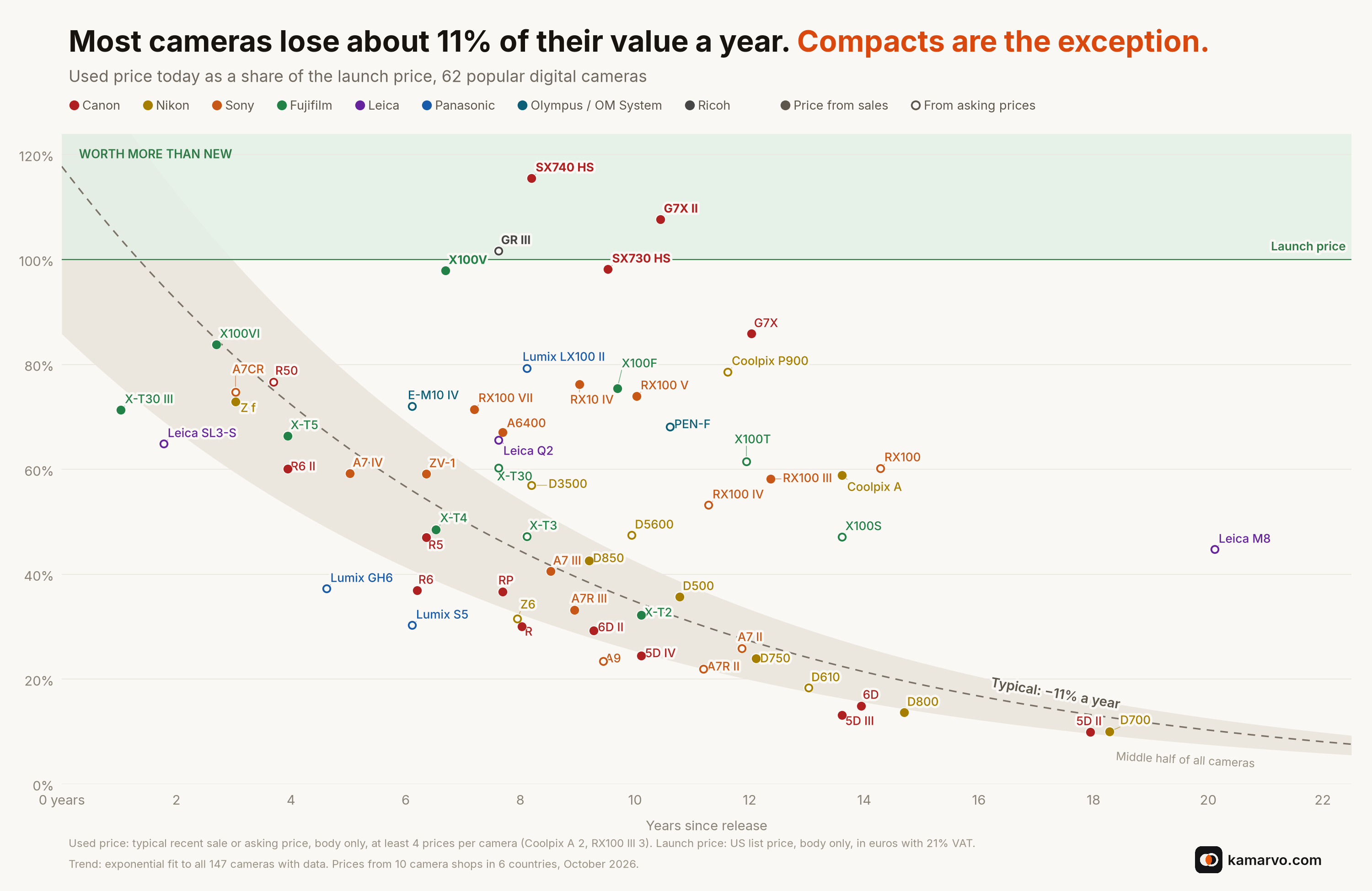
OC [OC] Used price vs. launch price for 62 digital cameras, by years since release (updated)

Post image
28 Upvotes

Updated version of the chart I posted yesterday. Thanks for the feedback. Changes:

  • Shaded band showing where the middle half of all cameras sit, so the outliers stand out
  • Green zone for cameras now selling above their launch price
  • Clearer labels that no longer clash with the lines, a cleaner legend, and less text overall

What it shows: a typical camera loses about 11% of its value a year. The clear exceptions are compacts. The Canon SX740 HS, G7X Mark II and Ricoh GR III now sell used for more than they cost new, and the Fujifilm X100V is close. Older full-frame DSLRs like the 5D Mark II and D700 are down to about 10% of their launch price.

Data: used prices are typical recent sale or asking prices, body only, with at least 4 prices per camera (2 for the Coolpix A, 3 for the RX100 III). They come from 10 used camera shops in 6 countries, collected October 2026 on Kamarvo, a used camera price tracker I built. Launch prices are US list prices at launch, body only, from Sharply and the makers’ announcements. They’re converted to euros with 21% VAT so they’re comparable with the EU used prices. The trend line is an exponential fit to all 147 cameras I have data for, including the ones not shown.

Tools: Python, matplotlib, adjustText for label placement.


r/dataisbeautiful • • 14h ago

OC [OC] Airfare change in the 30 busiest U.S. metros, 2025 to 2026, with and without Spirit

Thumbnail
gallery
21 Upvotes

r/dataisbeautiful • • 23h ago

OC [OC] The 30 busiest tourist cities of the EU: nights per resident and share from abroad, 2025

Post image
87 Upvotes

r/dataisbeautiful • • 3h ago

Museum Ticket Prices by Country: 1,086 Museums Compared

Thumbnail
monkeyeatingmango.com
1 Upvotes

The post contains the raw data and methodology at the bottom. If someone is interested, we can work together to enrich it. This is based on only 1/3rd of the available museums.

The page also contains:

  • How much is a museum ticket?
  • Where are museums free?
  • Can you trust an AI planner's museum prices?
  • Do locals pay less than tourists?
  • Methodology and link to raw data

r/dataisbeautiful • • 9h ago

OC [OC] Only 97 of 6,445 confirmed exoplanets were discovered by direct imaging

Post image
5 Upvotes

r/dataisbeautiful • • 13h ago

OC [OC] Life expectancy vs GDP per capita (log scale), 1960–2024, sized by population

13 Upvotes

Data comes from the World Bank (life expectancy at birth, and GDP per capita in current US$, since PPP only goes back to 1990), and the chart was made with demoguessr.com/#stats.

In 2024 the correlation is r = 0.85 on the log scale.

Watch China in 1960, sitting at around 30–35 years during the famine. Because GDP isn't adjusted for inflation, part of the drift to the right is just inflation.


r/dataisbeautiful • • 1d ago

OC 829 Van Gogh paintings in chronological order, each bar showing that painting's colors [OC]

Post image
1.7k Upvotes