r/DataArt • u/ExcellentWinner7542 • 11d ago
Ranked: Inflation vs. Consumer Confidence by Country
1
Upvotes
r/DataArt • u/ExcellentWinner7542 • 11d ago
r/DataArt • u/ExcellentWinner7542 • 12d ago
r/DataArt • u/ExcellentWinner7542 • 13d ago
r/DataArt • u/ExcellentWinner7542 • 13d ago
r/DataArt • u/dumbdataguy • 15d ago
Enable HLS to view with audio, or disable this notification
Every lap of the Australian GP from 2022–2026, turned into a pile of circles.
Each circle is a drivers lap.
The bigger the circles the slower lap.
Left to right is the lap number.
Each row is a different year.
Then I duplicated the whole thing a bunch of times, changed the colours, line weights, transparency and positions, and layered them all up 🤷♂️
So basically… 5 years of F1 lap data turned into this weird little data blob.
r/DataArt • u/ExcellentWinner7542 • 16d ago
r/DataArt • u/Brooklyngaijin • 16d ago
Renowned Japanese printmaker Hokusai’s Great Wave off Kanagawa is one of the world’s most widely seen artworks.
This interactive website visualizes the words users associate with the Great Wave in a word cloud, along with the locations of image servers returned by Google Image Search on a world map. Both the word cloud and map grow as users search for more words.
This is an early dataset, and I’m curious to see what patterns emerge as more people participate.
r/DataArt • u/ExcellentWinner7542 • 16d ago
r/DataArt • u/ExcellentWinner7542 • 16d ago
r/DataArt • u/ExcellentWinner7542 • 17d ago
r/DataArt • u/Glittering_Rip5167 • 17d ago
I see that
1- Frontend mostly ended ( except in big companies)
2- Backend will merge with Ai engineering ( Rag systems…etc) i think this is the new backend
3- Data engineer + data analysis + data science + ML = full stack data engineer ( and that will require high math , statistical skills) and mostly cs degree or Ai degree to have infra statistics and descriptive ( may be master like Data science)
I do not know if anyone see that also 🤷 am i alone ?
r/DataArt • u/ExcellentWinner7542 • 18d ago
r/DataArt • u/UsefulWay3159 • 19d ago
r/DataArt • u/ExcellentWinner7542 • 19d ago
r/DataArt • u/kobimantzur • 29d ago
Enable HLS to view with audio, or disable this notification
Built this as a visual interface for exploring the relationships inside a freight brokerage - customers, people, processes and company knowledge.
Built with React + Three.js and open sourced here:
https://github.com/kobimantzur/company-brain-3d
Live demo: https://trymyloai.com
Would love your feedback :)
r/DataArt • u/Super_University_821 • Sep 05 '26
Interactive: https://papargyri.github.io/correct-the-map/
r/DataArt • u/Usual-Director92 • Aug 31 '26
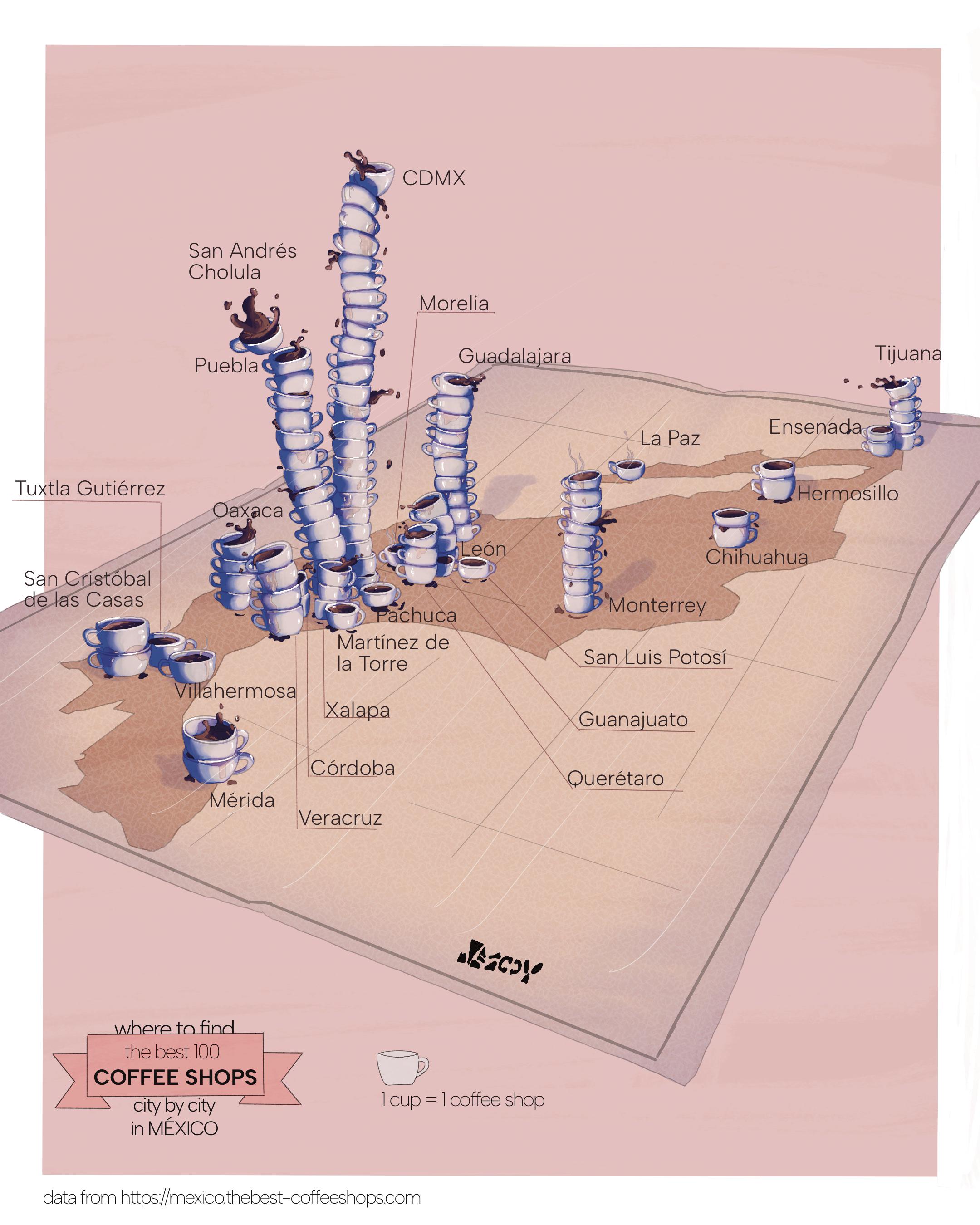
I’ve been thinking a lot about how traditional artists draw inspiration from nature, human emotion or even pop culture. In my case I want to draw artistic inspiration directly from data.
This isn't an infographic even though information design is at it's core but it's not an editorial illustration either. Or it could be both. I wanted to emulate what some cartoonists do when they draw about a topic but in this case a draw inspired by the data coming from this site https://mexico.thebest-coffeeshops.com/
Each coffee cup represents 1 mexican coffee shop from the top 100 list, stacked geographically.
r/DataArt • u/Aagentah • Aug 27 '26
r/DataArt • u/Mootjuh0 • Aug 27 '26
r/DataArt • u/jshaw3 • Aug 11 '26
r/DataArt • u/kikohs • Aug 04 '26
This work shows how the burden of potentially preventable hospitalizations varies from county to county. Even within the same state, neighbouring counties can have very different histories.
The image is built from thirteen years of records in the Healthcare Cost and Utilization Project by NORC. Each thin line represents one county from 2011 to 2023, with counties grouped into columns by state. Dark blue marks a lower average burden; copper and amber mark a higher one.
The work is not a ranking of counties or a diagnosis of failure but it makes a local and uneven health pattern visible at a national scale.
r/DataArt • u/telohtrab • Jul 30 '26
r/DataArt • u/cellar-d00rs • Jul 29 '26
https://reddit.com/link/1vad6o8/video/3fh2y7qo99gh1/player
A chart from a visual essay I made on what can be learned about society from changes to ESL (English as a Second Language) vocabulary lists, published on The Pudding.
I used the General Service List (1953) and its updated version, the New General Service List (last revised in 2023). Both have been shown to cover at least 84% of "everyday English use" (and up to 97% in some cases)
The lists were made as practical teaching tools, built to capture which words people learning English would need the most. Because of the high coverage rate, the answer also doubles as a snapshot of ordinary life, 70 years apart: what people were expected to engage with, and had to deal with, in their daily lives.
The full live piece: https://pudding.cool/2026/07/essential-words/