r/BobsTavern • u/mosquitosarenotcool • 7h ago
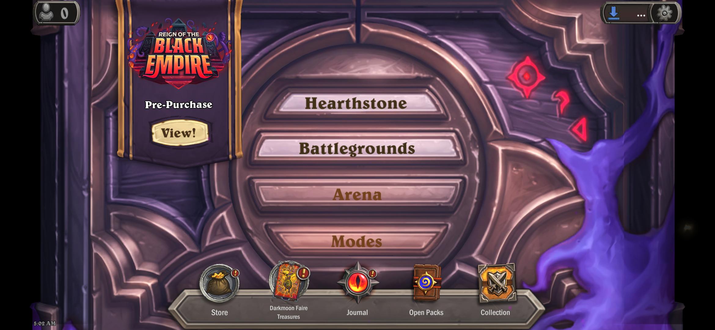
Discussion Finally it doesn't look overcrowded
16
u/Queasy-Lab-6406 7h ago
it screams mobile ui
4
2
2
3
u/CryingLikeTheWind 6h ago
Sure but it’s like putting lipstick on a pig until they make the game play better.
1
1
u/shakuntalam88 6h ago
If they are anyway investing so much time and effort on creating custom thematic design every season, why can't they just redesign the outer frame itself to accomodate more buttons now? It's like pasting random stickers all over...
1
1
u/QueenOfThePiratez MMR: 6,000 to 8,000 3h ago
Since the game is written in Unity - this change took like 1 day with testing and documentation. Now maybe fix the gameplay ;)
1
u/Argorash 1h ago
It's absolute jokes that they've added so much nonsense into hearthstone that it needs a taskbar and even after that its still got a banner ad on the side.
1
9
u/--__--__--__--__-- MMR: 8,000 to 9,000 5h ago
I don't like how it's almost touching the modes button, it needs more separation. Actually I just don't like a lot about it.